Why brand identity should be your priority
When it comes to your brand you want your audience to see your logo and envisage who you are, your service and ethos.
If you don't know what your brand says about you we think it's time for a think...
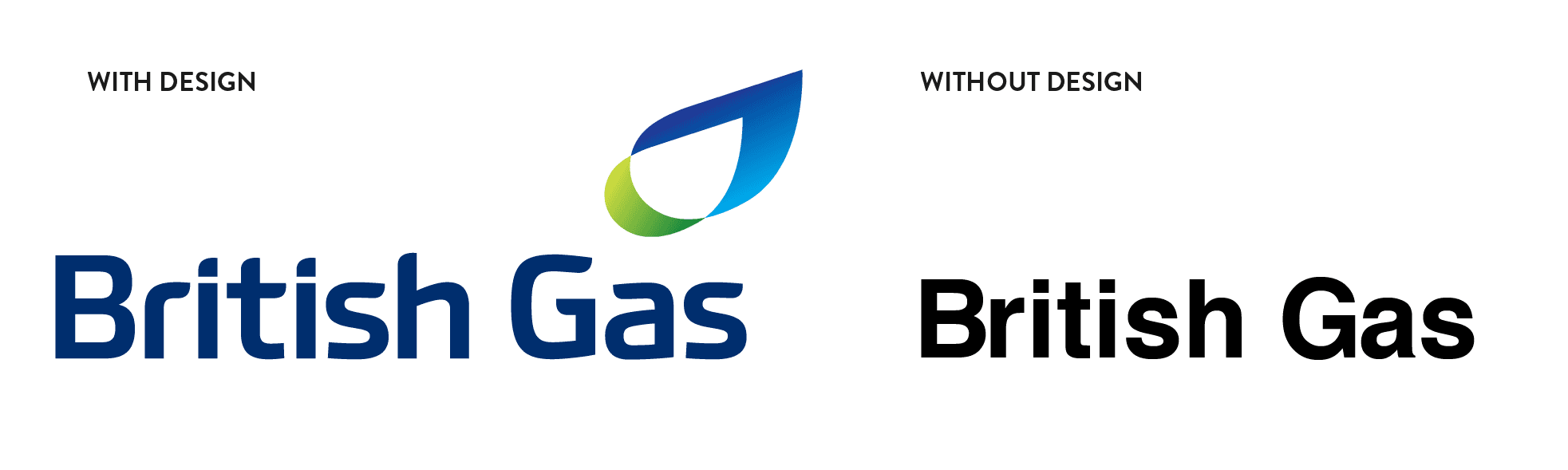
Establishing your brand is a vital part of running a business in modern Britain, as it’s no longer enough to have great products or services, your customer is loyal and having a crest your army of loyal supporters can stand behind is a sure fire way to keep them loyal. Don’t get me wrong, If the British Gas (BG) logo was just plain text printed on a document, people would still be customers, they would still be loyal and even though having gas provided by BG is more expensive than their competitors, people still choose them. Why? Because British Gas is a brand, nationalistic by name, but it stands for stability and longevity, holding the term British/Britain, it holds the company accountable as a national brand. It says, this is the best Britain can offer. The product is no different from what you would get from a competitor, their current service offering isn’t any different, yet they still hold 27% of the market share, double that of even the second largest provider.
Establishing what you stand for early on helps you to find and retain loyal team members and customers. So what happens when a company rethinks it’s brand in the public sphere. This happens in with a higher frequency than you may think.
Why change your logo?
There are a number of reasons why a company may change its logo, but a full rebrand can be down to a merger or the design itself is tired and needs invigorating, other reasons such as to stand out from a competitor or when your brand jars culturally with a customer touch-point. Again, there are lots of reasons why a brand design might become tired, some examples…
- The final design was a response to a current trend, now that the trend is over, it makes the brand look old.
- When the company began, the brand design was representative, but now the company is much more, they need visuals that represent this.
- A company goes in a different direction and it wants to represent this
- The brand was designed by people with no design knowledge and it is unable to perform in modern situations.
These are just a few examples and no company is immune to environmental impact on brand design.
Sometimes a company gets it right from the start. They do this by following the rules.
- Keep it simple
- If it doesn’t work in Black and White, it doesn’t work
- Make it legible
Getting it right first time
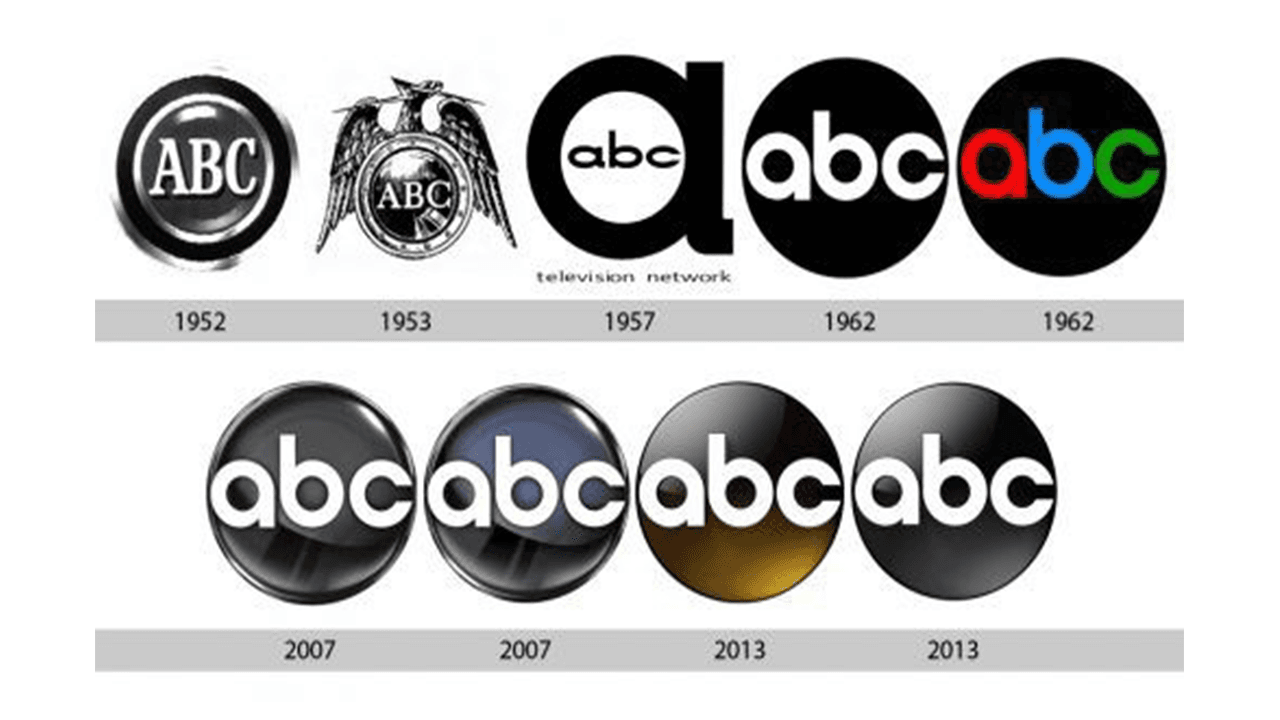
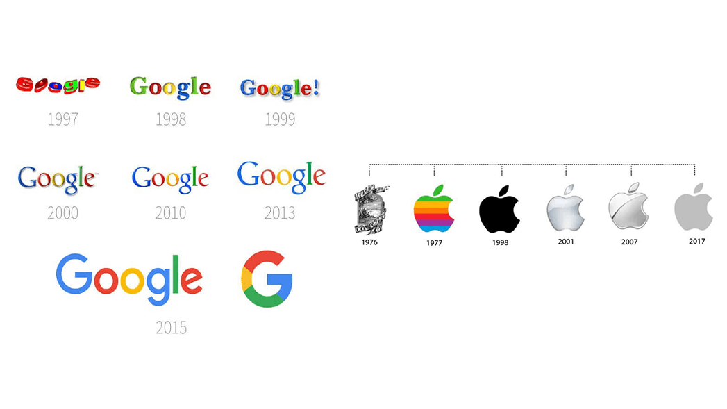
An example of getting it right is the US Network abc, in their 150 years their logo has changed 9 times, and only 2 designs could be considered different by comparison. Contrast that with a company who should know better; Apple, since 1976 have had 6 logos and only 1 major change or Google, who’ve had 8 major redesigns since 1997. The changes or lack of changes happen as a result of not following the above rules, which eventually all companies capitulate to.
An example from our brand journey
NPK Media have had only 1 logo design change and are in the process of a colour palette change. The initial change was the result of a non-designer being tasked with the job and meeting a business owner brief. This logo didn’t spend much time in the wild and is only visible on one video. By the time we fully launched the company at expo, our new visual brand was born and adopted.
Knowing about the common mistakes most companies make when choosing a design to represent their brand is to throw the kitchen sink at it, I’m no different, I wanted to represent all of the facets of the company in one design, knowing we would offer a few services and that the company would need ways to express this at brand level. I wanted to make sure all bases were covered, and knew the only way to do this effectively was to simplify the design and represent services another way.
Creating the anatomy of our logo (our viewfinder symbol/insignia), I started by asking what do all of our services have in common at the fundamental level; composition, light and sound. Whether video, web, design, much of what we do is on a screen. I’d remembered a beautiful brand concept Sony had made for the VIO range of products. The symbol takes the sine wave (analogue sound) and IO for digital to make up the original acronym Video Audio Integrated Operation and breaking it up into something simple and pleasurable when you’re in-the-know. I wanted a piece of this for NPK Media.
So I started with the sine wave (∿) for sound, the diode for light(), the play button for playback and the circle to represent composition.
Composition The simple circle is an all-encompassing symbol that shows our inclusivity. At the start of creating the logo, we used the golden ratio (a universal depiction of beauty in its most simple form) to compose the circle. This allows versatility down the line.
Light We chose the diode, as it represents everything modern in current light technology; efficient, bright and long lasting. We use light for video, it permeates every part of our work process.
Sound We adopted the analogue sound wave, also known as sine wave. Chosen for its relationship to music and audio, it’s an obvious fit.

Play Button The play button is a synonymous symbol of the action of audio and video playback. It also happens to be the symbol for a diode in an electrical diagram when you take the horizon line into account.
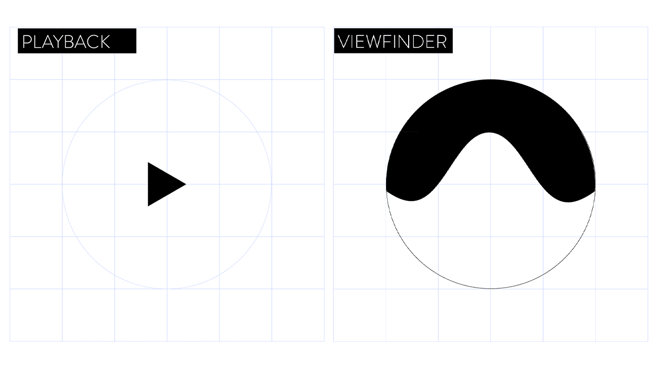
Viewfinder This comes as a result of a childhood memory (somewhat skewed by time), using the Disney ViewMaster™. A device that let you take a circular disc of photographic negatives, and view them in full colour through the eyepieces on the back of the device. This is our element of playfulness and takes us back to our first interactions with media as a child.
Construction of the logo was a difficult task. Taking all of those elements and hiding them in plain sight. We went through a number of iterations before we hit on the final composition. As anybody finds out working with geometry, what’s perfectly geometric, isn’t optically perfect. So we had to jig a few things around to make things fit. But in the end, we were left with a symbol of identity. It says who we are, It’s simple, works in black and white, understandable/legible came with font choice (that’s another blog post entirely).
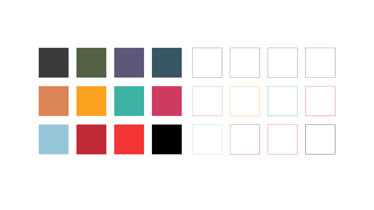
This explains how we came up with a visual representation of our identity. So how was it future proofed. The simplicity of the logo meant that it was adopted immediately, splashed over clothing and giveaways, and posted en masse in our social streams. In order to show versatility, we chose a colour palette that represented diversity and decide that colour would play a big role in helping people to identify an aspect of the company that represented them. We had colours for Public interactions, B2B and internal. We allowed the content to drive colour choice and it just worked. Whether we were truly wedded to the colour palette, only time would tell. That time was 3 years in.
We’ve recently initiated a brand revitalisation, changing our primary business colours to a new set, with rationale. We took colour theory and decided that employees can self-identify the right logo for the right content. We’ve reserved a certain set for Public and Internal, but essentially want people to be as expressive as they can. As long as we keep things simple, the brand will always convey the right message.
As an overview, the brand looks complex. In order to provide an array of functions, we’ve had to ensure the brand can be quickly accessed as a task is being complete. We have a design system, known as a brand identity document that helps users of the logo to quickly assess what goes where in a 3 step process that asks where the logo will go (public/Internal), and which medium (screen or print) it will appear on.
One thing is for sure, we have a strong brand that can consistently represent our identity and culture in a way that can stand the test of time.
If you would like to get in touch about any part of your brand strategy. Use the contact form below.